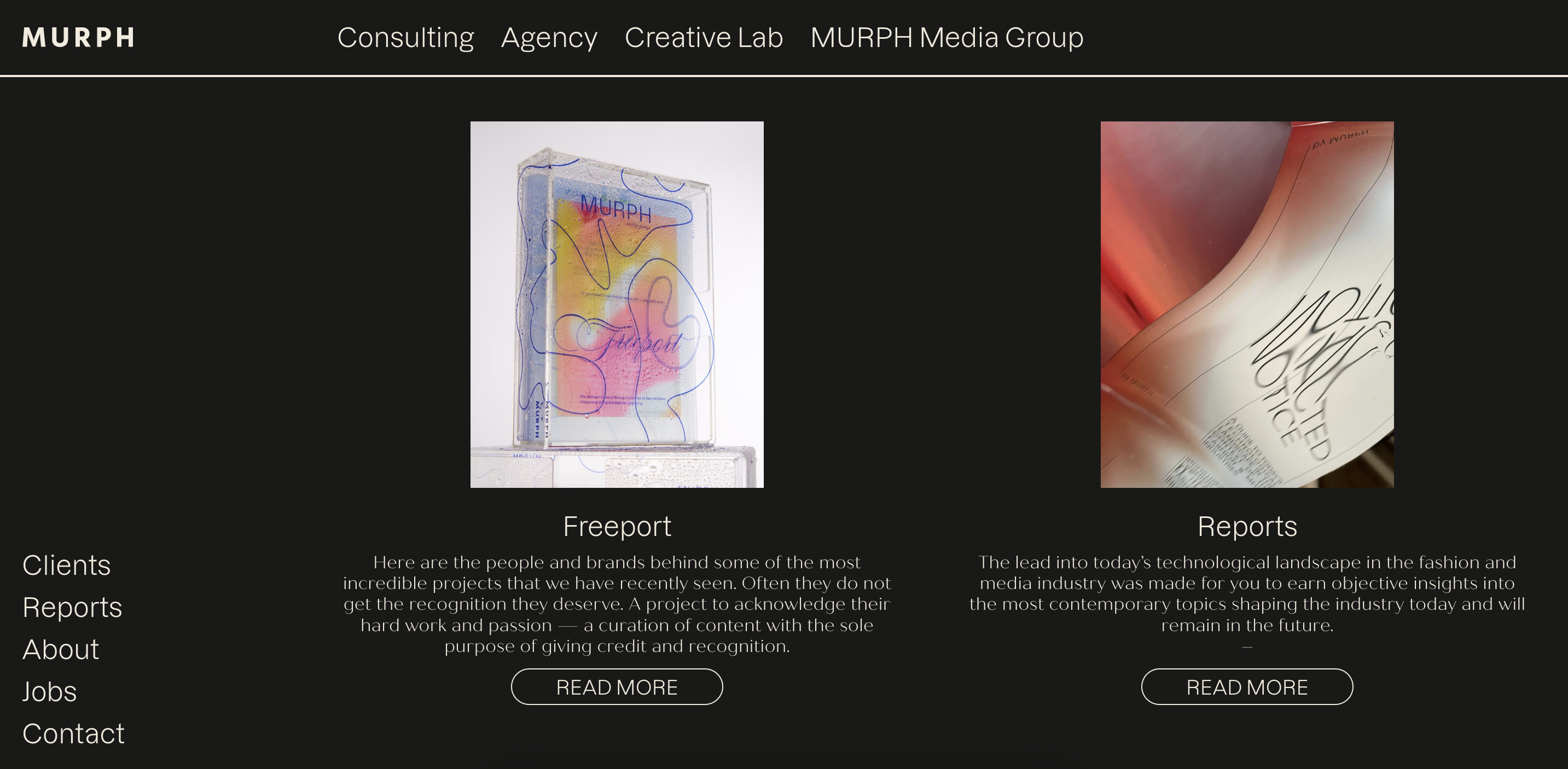
The Freeport
A multidisciplinary platform showcasing creative talent
Developed as a holistic brand experience, it spans identity, physical product and digital presence.
My role
Visual Designer and Art Director
Skills
Art Direction and Visual Design
Brand Creative Direction
Concept and Product Development
Team
MURPH
Context
Highlight the creative minds
Highlight the creative minds
MURPH, a creative agency and strategic consultancy specialized in fashion and technology, sought to continue its legacy and long-standing work around creativity.
The goal was to shape a vast collection of ideas, references and relationships, bringing them together into a single, tangible space.
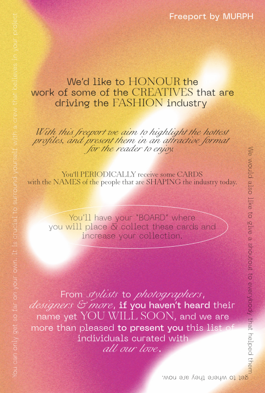
This vision led to The Freeport, initially conceived as a physical product and later expanded into a digital platform. The original concept was to create a curated object inspired by traditional encyclopedias, gathering creatives from multiple disciplines.
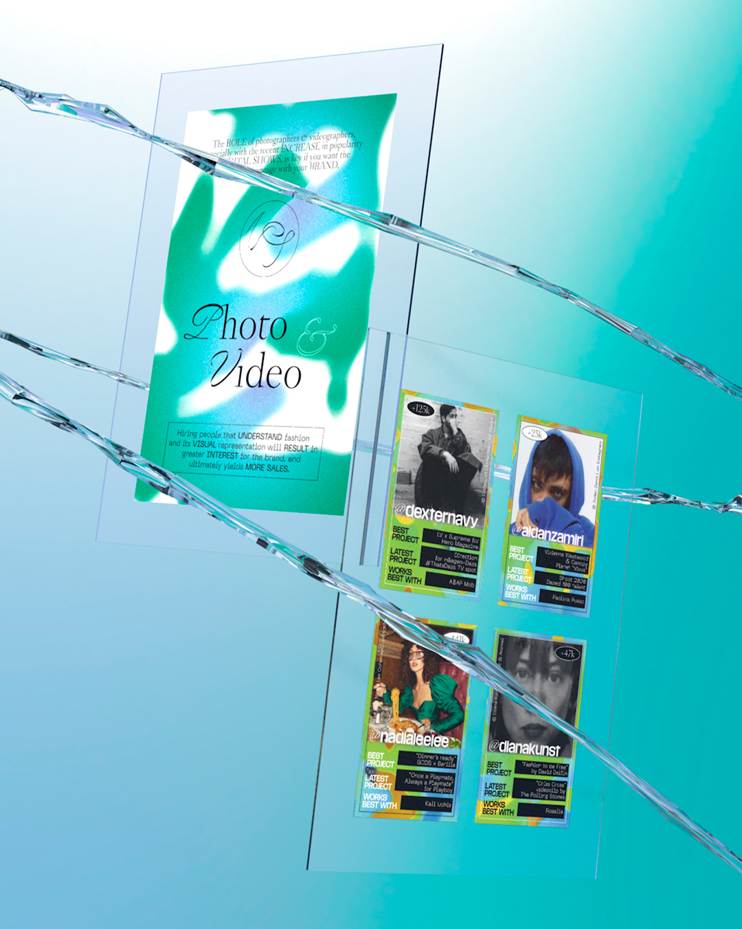
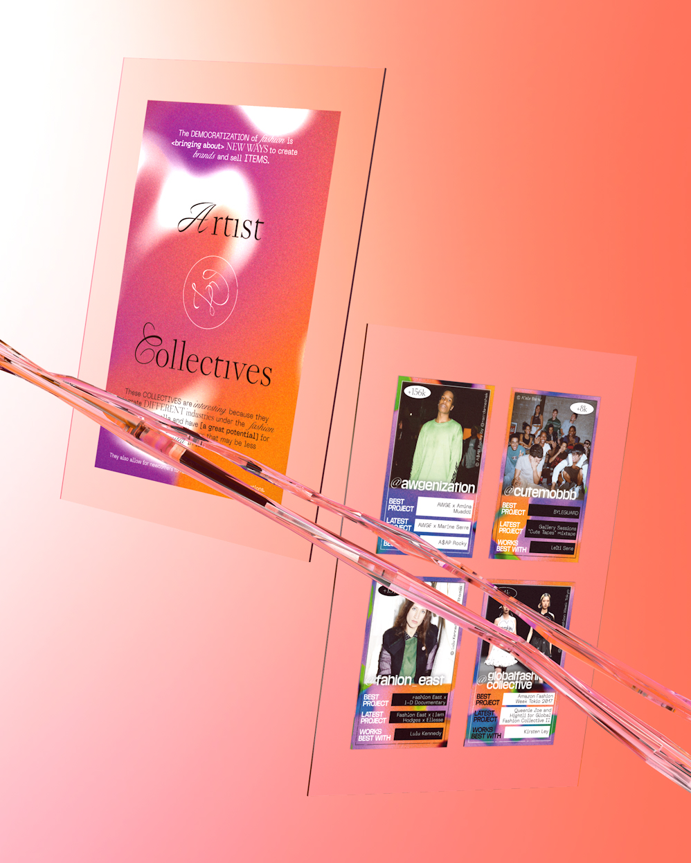
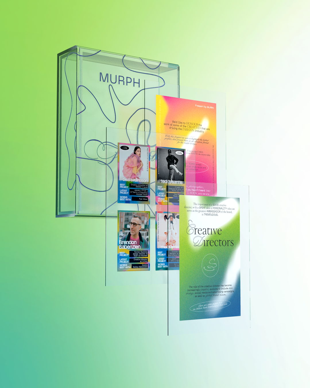
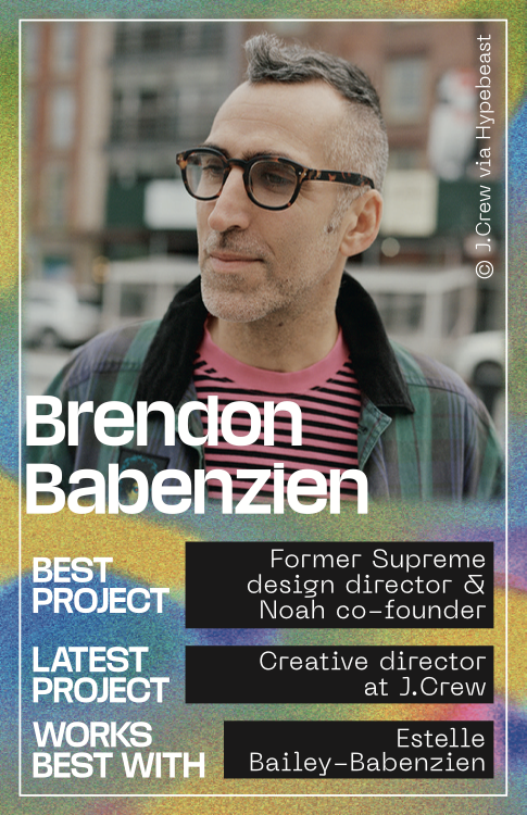
Each profile featured a concise overview of their most relevant projects, forming a collective archive of contemporary talent.
The goal was to shape a vast collection of ideas, references and relationships, bringing them together into a single, tangible space.
This vision led to The Freeport, initially conceived as a physical product and later expanded into a digital platform. The original concept was to create a curated object inspired by traditional encyclopedias, gathering creatives from multiple disciplines.
Each profile featured a concise overview of their most relevant projects, forming a collective archive of contemporary talent.
Born from the desire to give visibility to the creative minds behind the industry, The Freeport was conceived as an internal initiative at MURPH, a strategic brand consultancy.
The Design Process
Product Concept and Brand Identity
Product Concept and Brand Identity
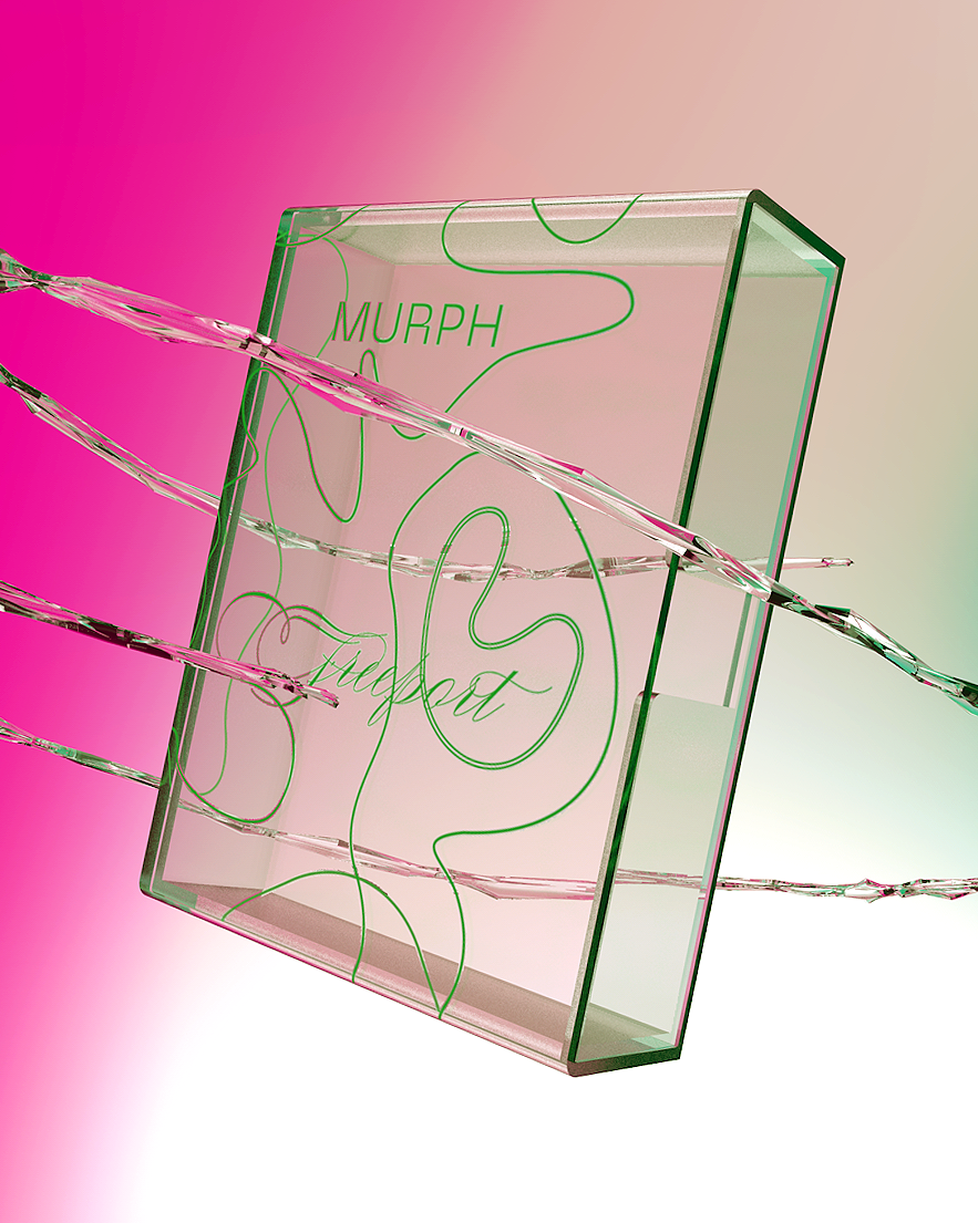
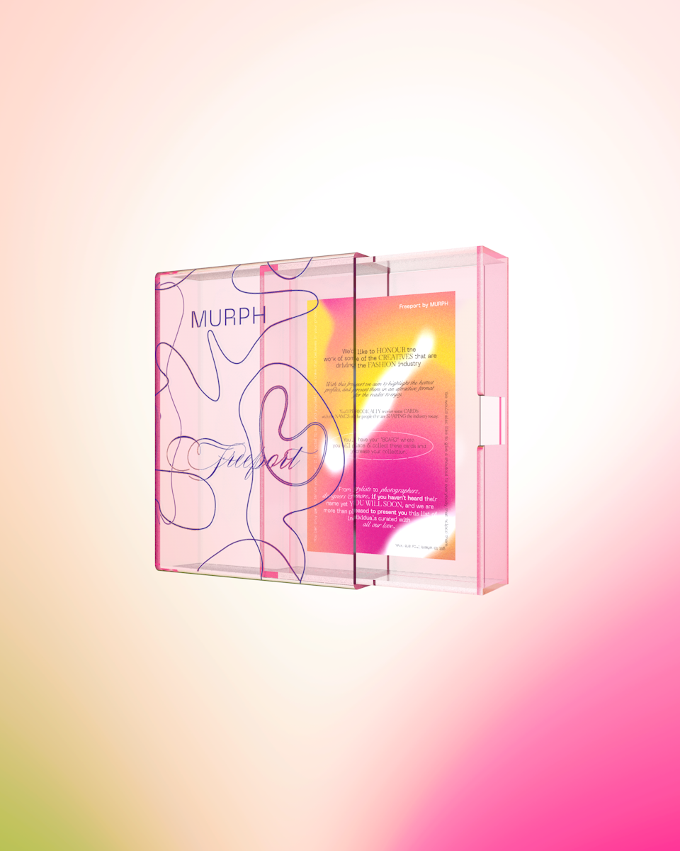
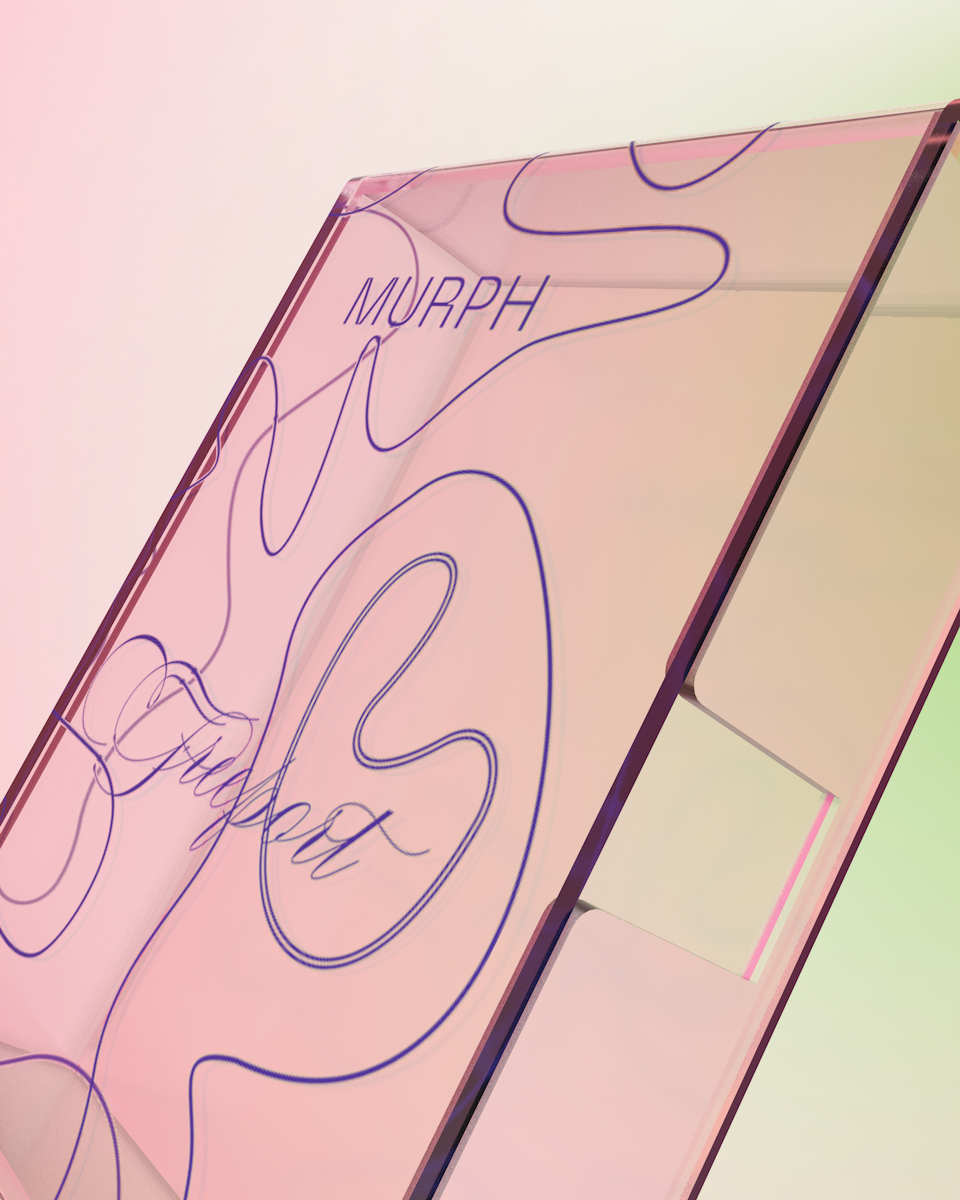
The first step was to define the physical format: How to translate the idea of collectible fascicles into an object with a contemporary aesthetic?
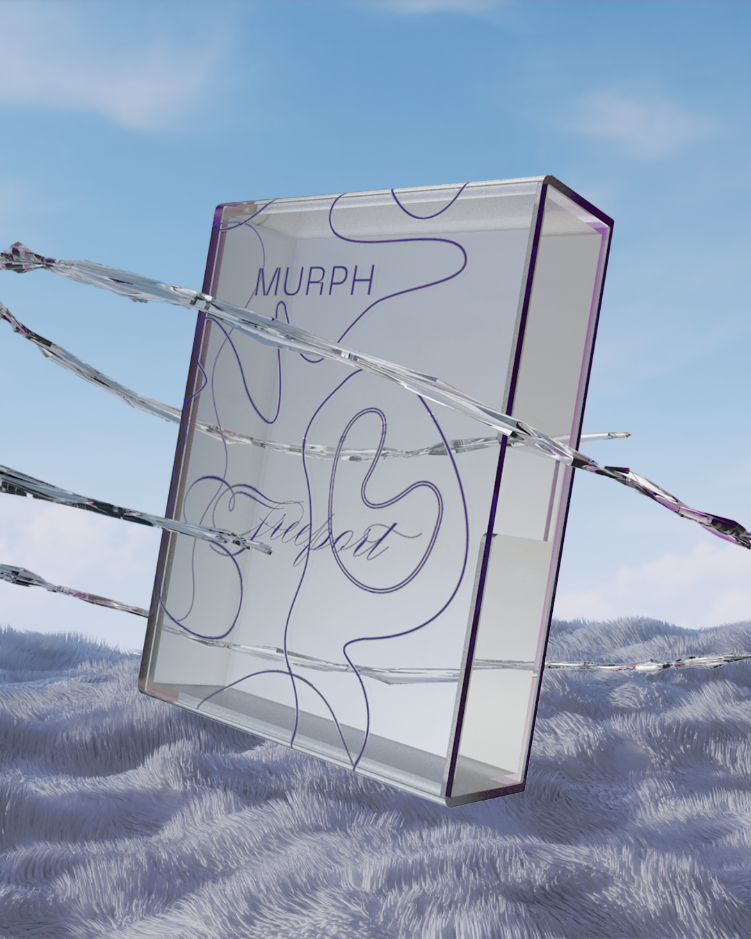
We envisioned a transparent material aligned with the studio’s branding — durable, refined, and suitable for high-quality printing.
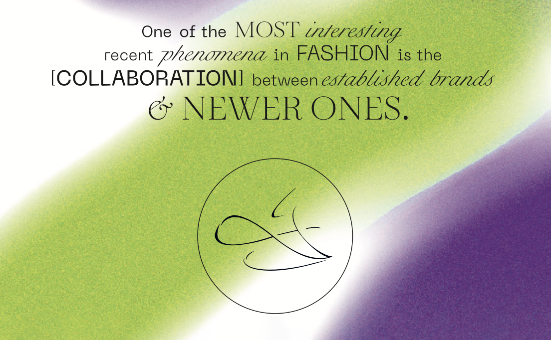
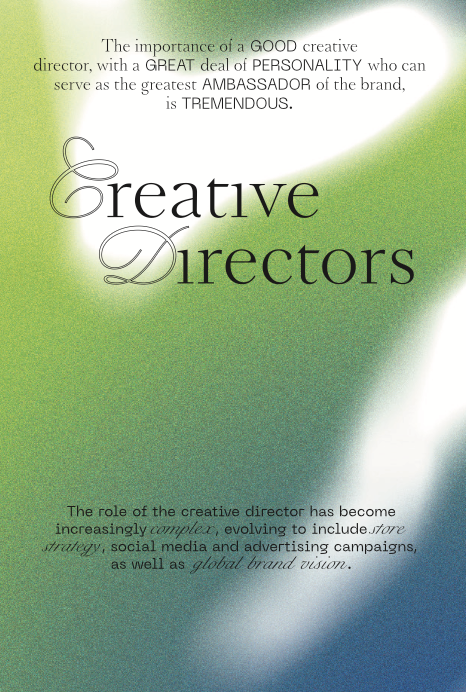
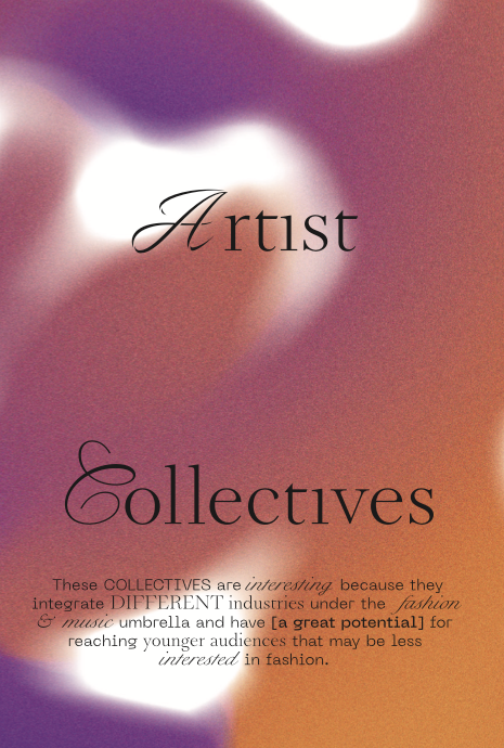
Once we had selected the material for the box, we needed to ensure it was fully printable. That’s when we shifted our focus to concept and branding. Our primary goal was to create a branding framework that incorporated a distinctive set of colors and patterns, while also selecting fonts that were both readable and printable. Each pattern needed to give its category a unique visual identity, while staying consistent with the overall brand across all covers and promotional assets. The process was centered on building a strong, adaptable visual identity—one that could flow seamlessly across categories while maintaining cohesion.
Step 1 – Brand Logo
We designed a logo in perfect harmony with MURPH’s consultancy aesthetic: a serif typeface that was elegant, timeless, and fully reproducible on the physical box.
Step 2 – Backgrounds
We created a neon color palette with bold gradients, giving each category its own visual power and energy, while remaining part of a unified look.
Step 3 – Fonts
While the MURPH logo and primary brand used serif fonts, we introduced a more ornate, Y2K-inspired typeface for the text on each card—adding personality and flair to every piece.
We envisioned a transparent material aligned with the studio’s branding — durable, refined, and suitable for high-quality printing.
Once we had selected the material for the box, we needed to ensure it was fully printable. That’s when we shifted our focus to concept and branding. Our primary goal was to create a branding framework that incorporated a distinctive set of colors and patterns, while also selecting fonts that were both readable and printable. Each pattern needed to give its category a unique visual identity, while staying consistent with the overall brand across all covers and promotional assets. The process was centered on building a strong, adaptable visual identity—one that could flow seamlessly across categories while maintaining cohesion.
Step 1 – Brand Logo
We designed a logo in perfect harmony with MURPH’s consultancy aesthetic: a serif typeface that was elegant, timeless, and fully reproducible on the physical box.
Step 2 – Backgrounds
We created a neon color palette with bold gradients, giving each category its own visual power and energy, while remaining part of a unified look.
Step 3 – Fonts
While the MURPH logo and primary brand used serif fonts, we introduced a more ornate, Y2K-inspired typeface for the text on each card—adding personality and flair to every piece.
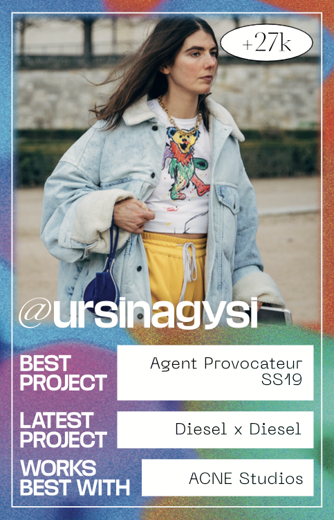
Each card would feature assets from different categories—stylists, musicians, artists—and sourcing high-quality, category-appropriate imagery was another challenge we embraced. The final result was a collectible trading-card system: four cards per category, each with its own color and gradient, printed in the brand’s palette, and housed within the product’s drawer.
This approach transformed every element into a tangible piece of the brand experience, creating a collectible world that was both visually striking and fully connected to MURPH’s identity.
Impact
From tangible to digital
From tangible to digital
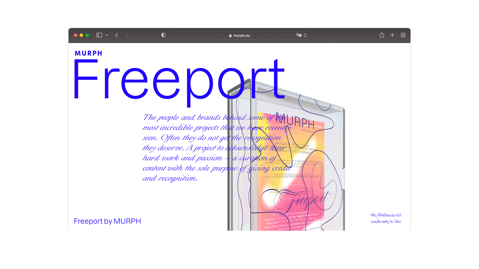
Following the positive reception of the project, we decided to create a microsite to make its digital version available for download.
Instagram filters and more Digital Reports
Building on this impact, we brought the experience to life digitally with interactive Instagram filters: recipients of the physical product could scan it and watch the water pattern come alive in 3D.
We also launched monthly trend reports on fashion and sales, available for download on the website—turning every insight into inspiration.
We also launched monthly trend reports on fashion and sales, available for download on the website—turning every insight into inspiration.