Digital Digest
Podcast Brand Identity
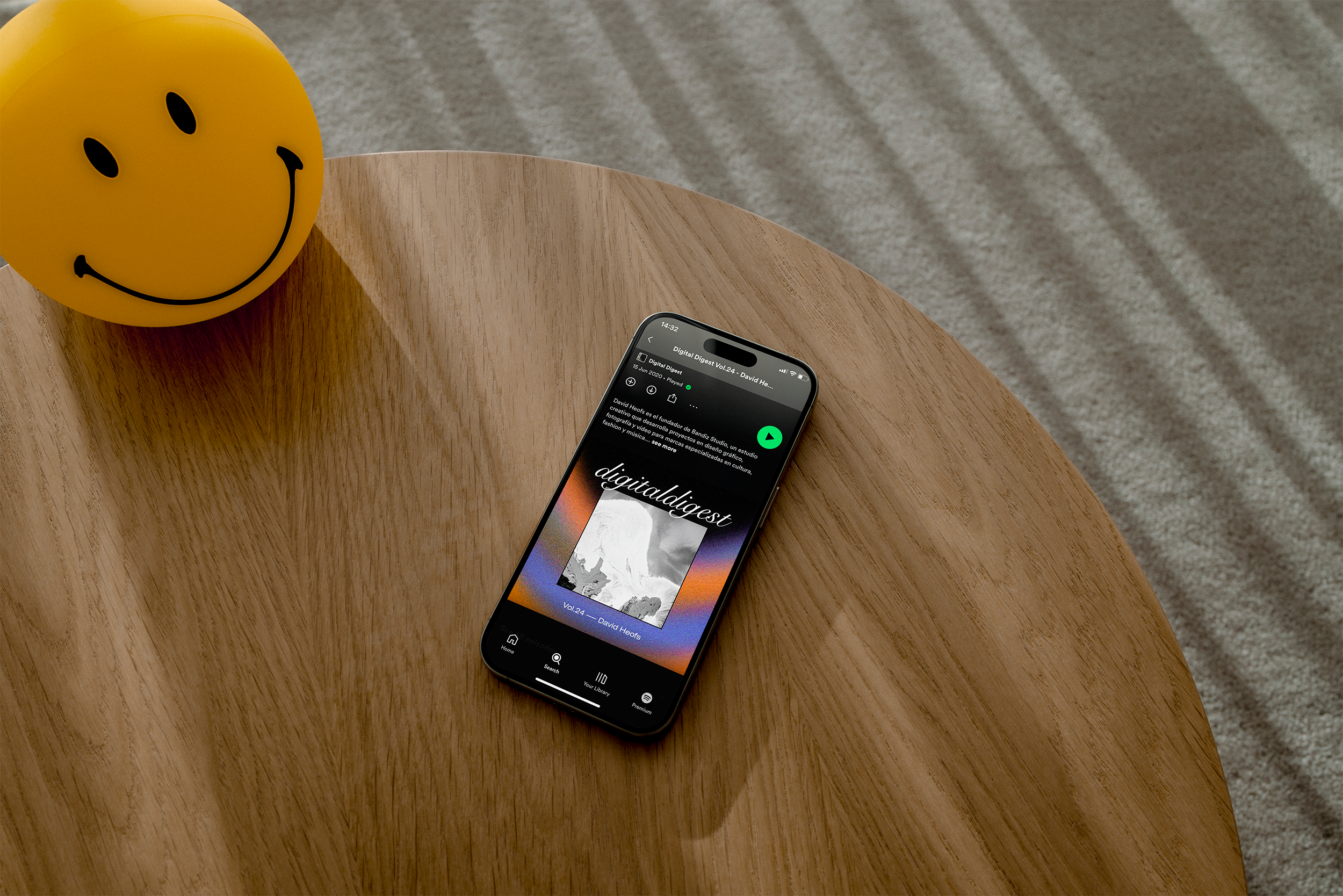
(Intro) Digital Digest is a podcast by 25Gramos, hosted by Gonzalo Vila, exploring the digital connection with the creative universe and its impact on multidisciplinary projects across artistic fields and brand communication.
Each episode features an in-depth conversation with some of the most influential voices in digital creativity, social media content, and brand relationships.
As Art Director and Visual Designer, I led the creative vision for the podcast’s branding. I designed and presented the concept moodboard, developed the logo, and created a modular system of patterns that could be easily adapted for each episode, ensuring consistency while allowing flexibility.
My role
Art Director and Visual Designer
Skills
Art Direction and Visual Design
Product Design
Brand Creative Direction
Stakeholder Management
Team
25Gramos, MURPH, Ricardo Juárez
Context
The main requirement was to create a branding system that included a distinctive logo and a set of editable patterns.

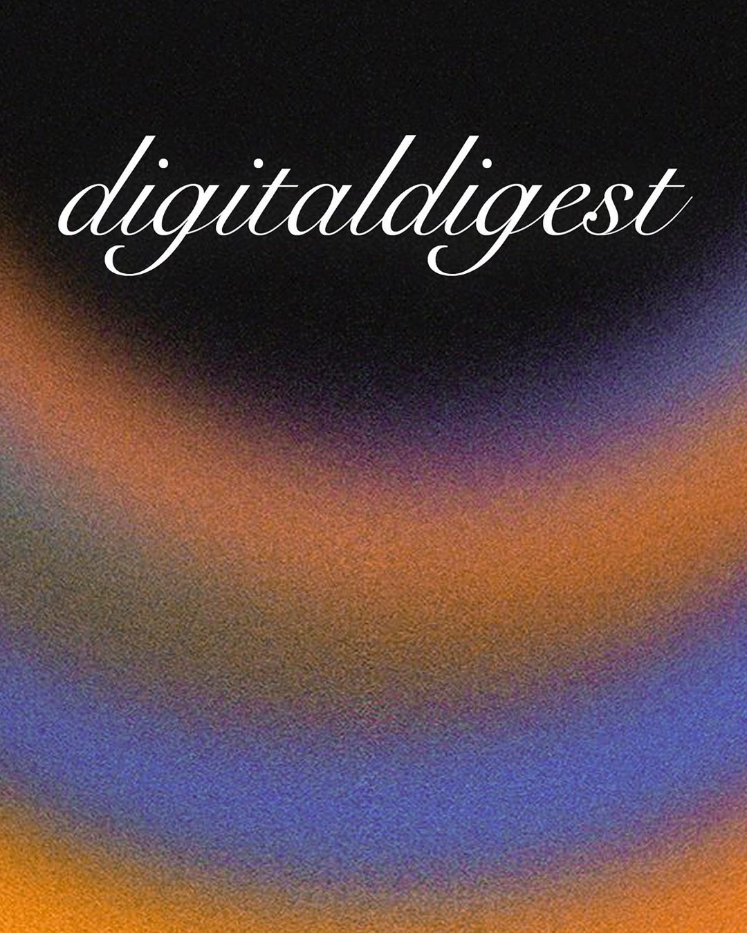
Brand Logo
Principal Background

Nature-inspired B&W swatches
The Design Process
Our primary task was to design a branding framework that incorporated a unique logo along with a set of customizable patterns. These patterns needed to provide each episode with a unique visual identity while remaining aligned with the overall brand for Spotify covers and promotional assets.
The process focused on creating a strong visual identity that could adapt across multiple platforms while maintaining consistency. Although Spotify was the main listening platform, we also wanted to create a small microsite hosted within the 25Gramos website and promote the podcast on their social media channels. For this, we collaborated with Bandiz Studio for development and designed various creatives and templates for the primary promotional channel: Instagram.
Step 1 - Brand Logo
We designed a serif-based logo that was highly legible yet carried a retro aesthetic. The goal was to differentiate it from the existing 25 Gramos brand logo, giving the podcast its own distinctive identity.
Step 2 - Principal Background
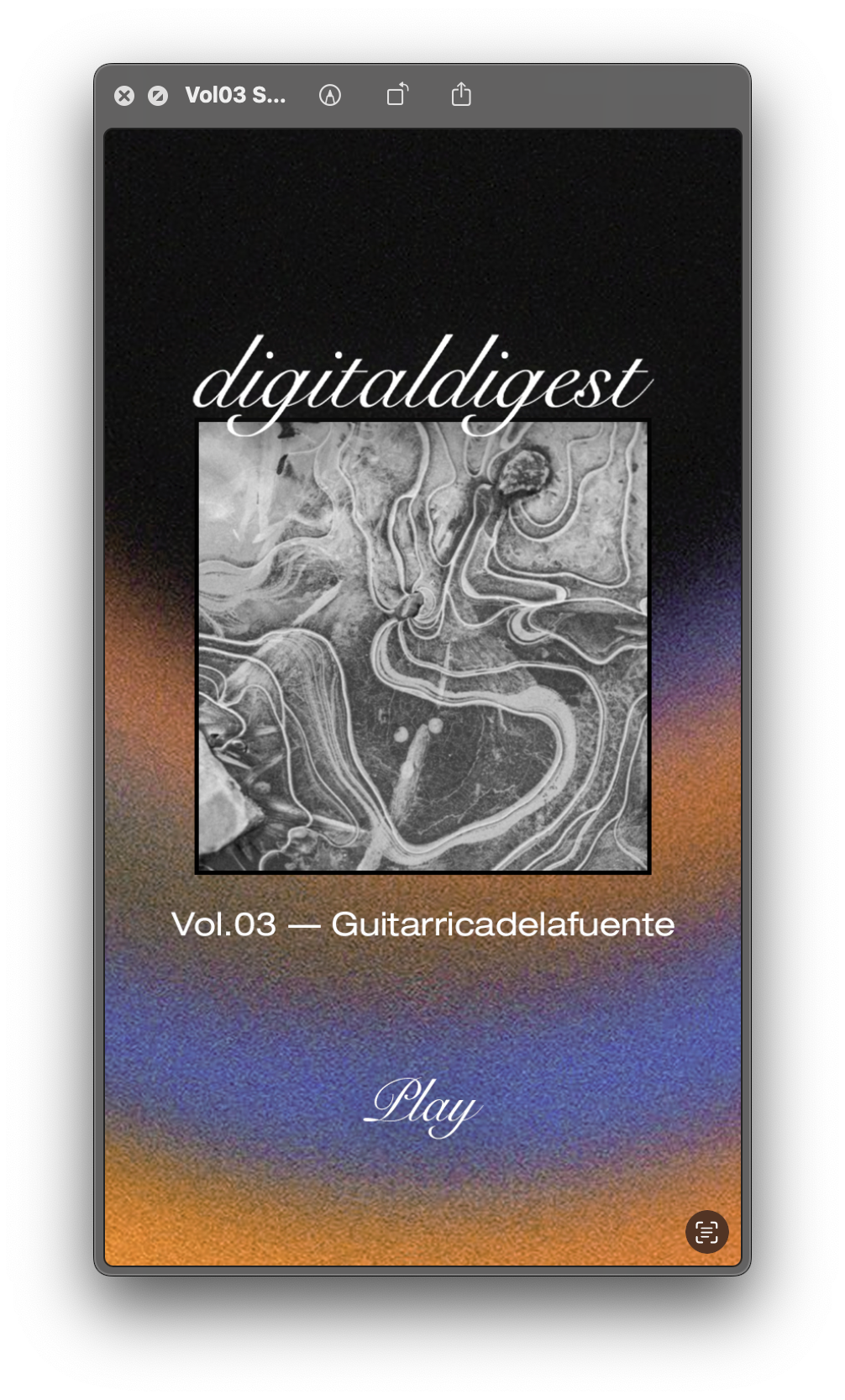
The main background featured gradient textures that were repeated across all episodes. Warm orange tones combined with black and purple hues, enhanced by noise and Gaussian blur effects, reinforced the retro-inspired look we aimed for.
Step 3 - Constantly Updated B&W Swatches
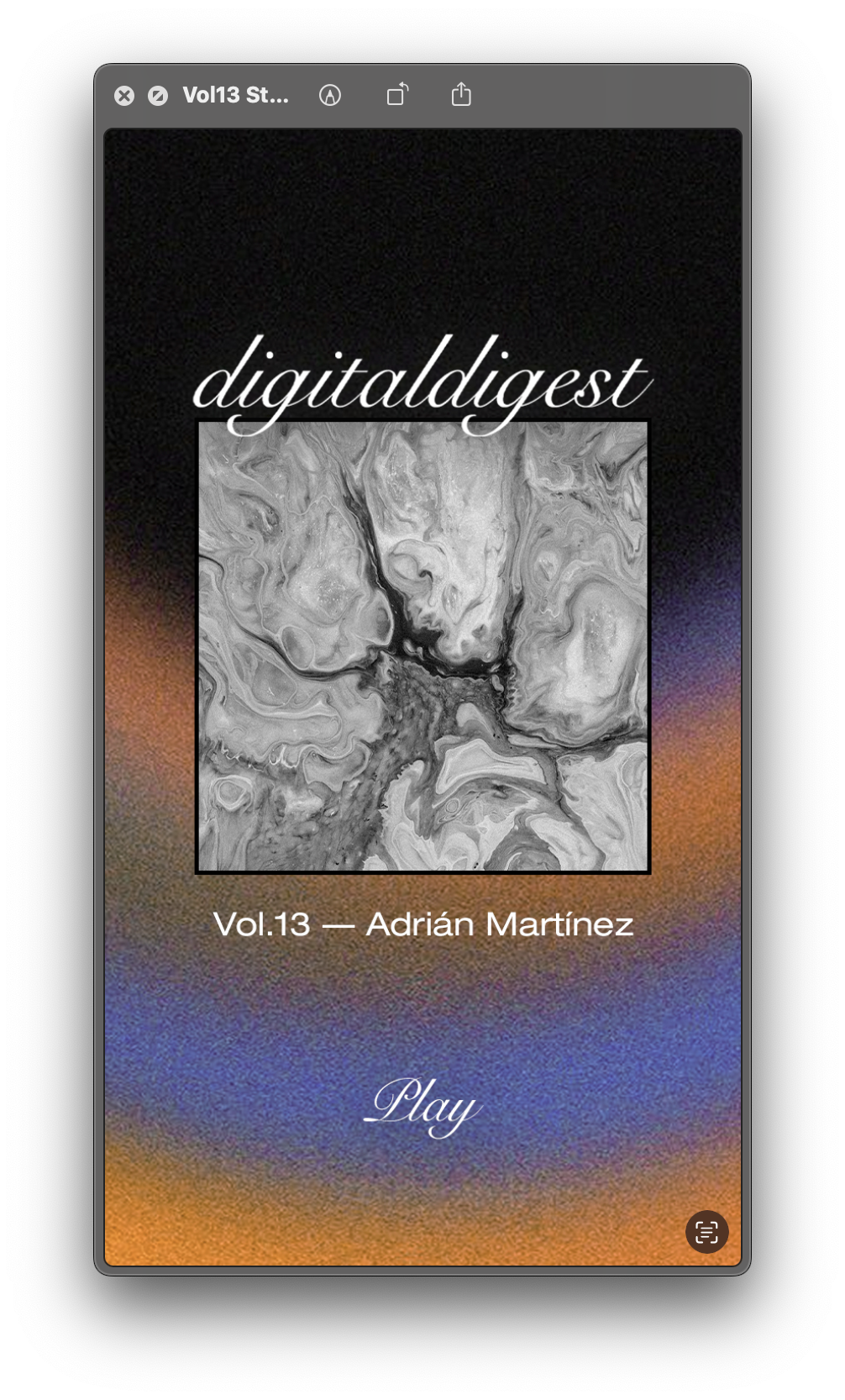
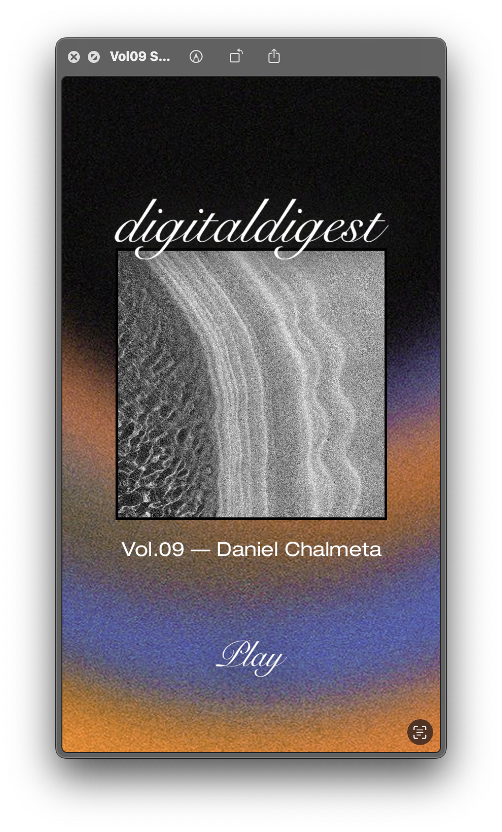
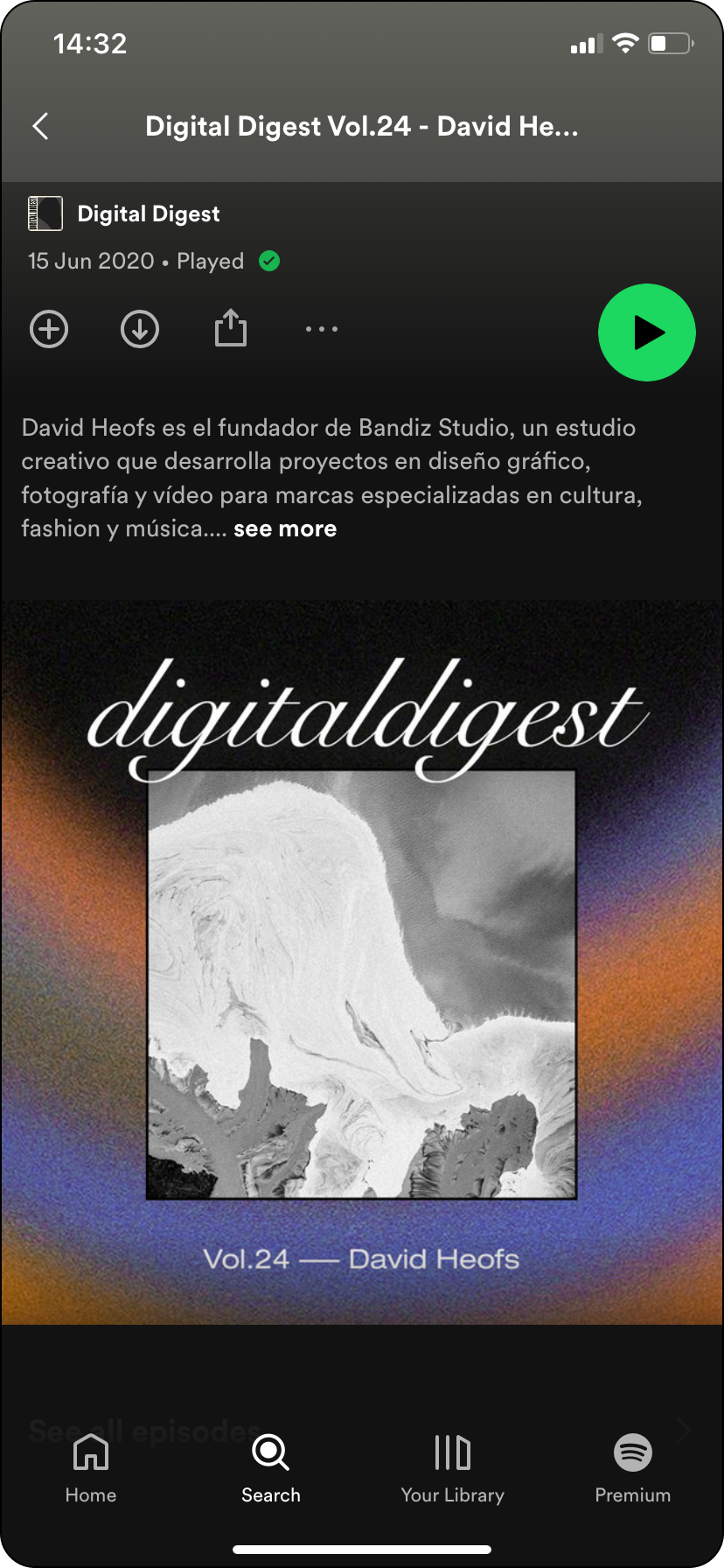
To make each episode unique, we introduced a central swatch placed over the gradient background. These swatches showcased black-and-white textures inspired by nature—like microscopic views of organic elements—framed to create a striking focal point. Each swatch was updated for every new episode, ensuring visual variety while maintaining brand consistency.
From web to Spotify
“Catch the podcast there, get the extras here”
“Catch the podcast there, get the extras here”
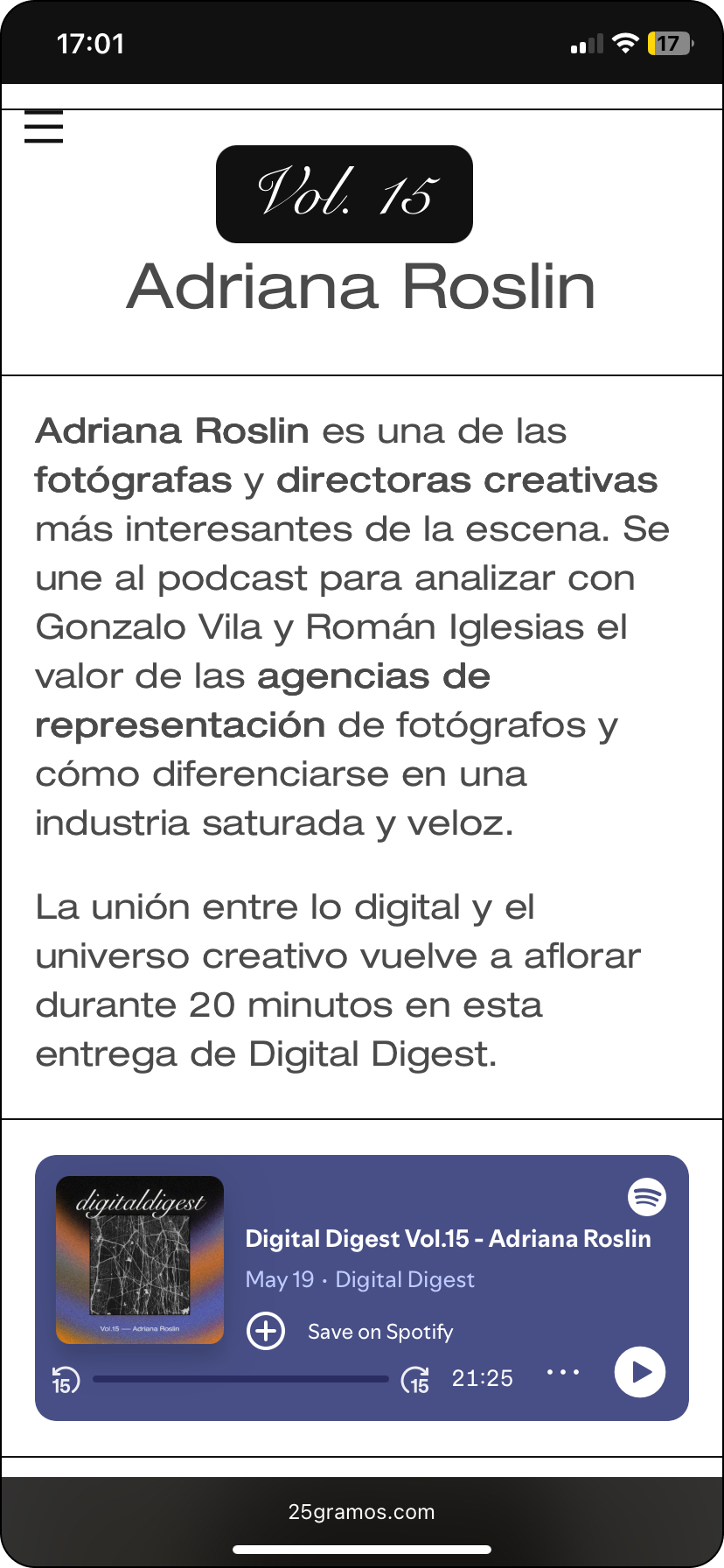
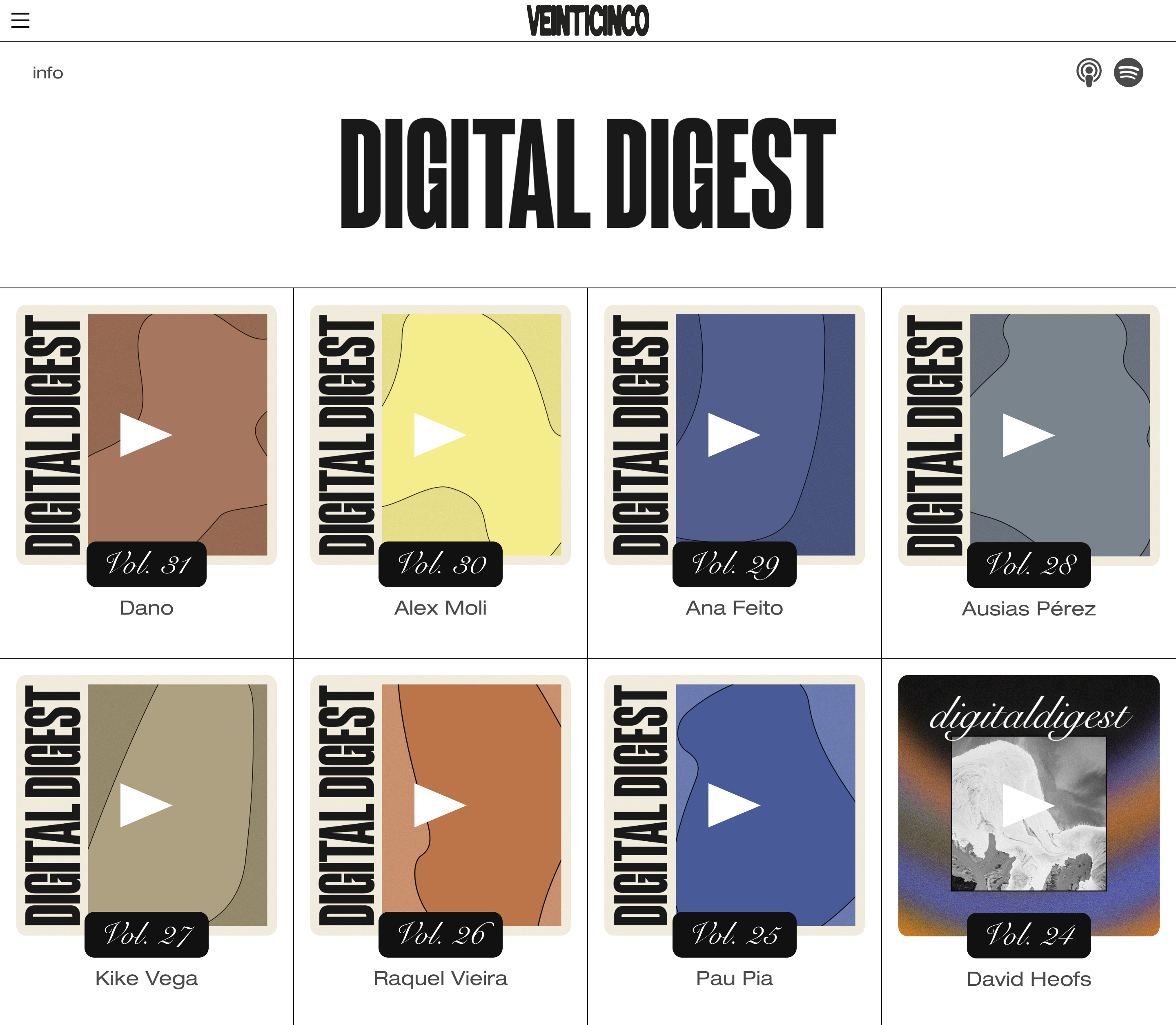
The microsite design was clean and minimal, built on a structured grid that showcased each episode cover prominently, led by the podcast logo and a concise information section.
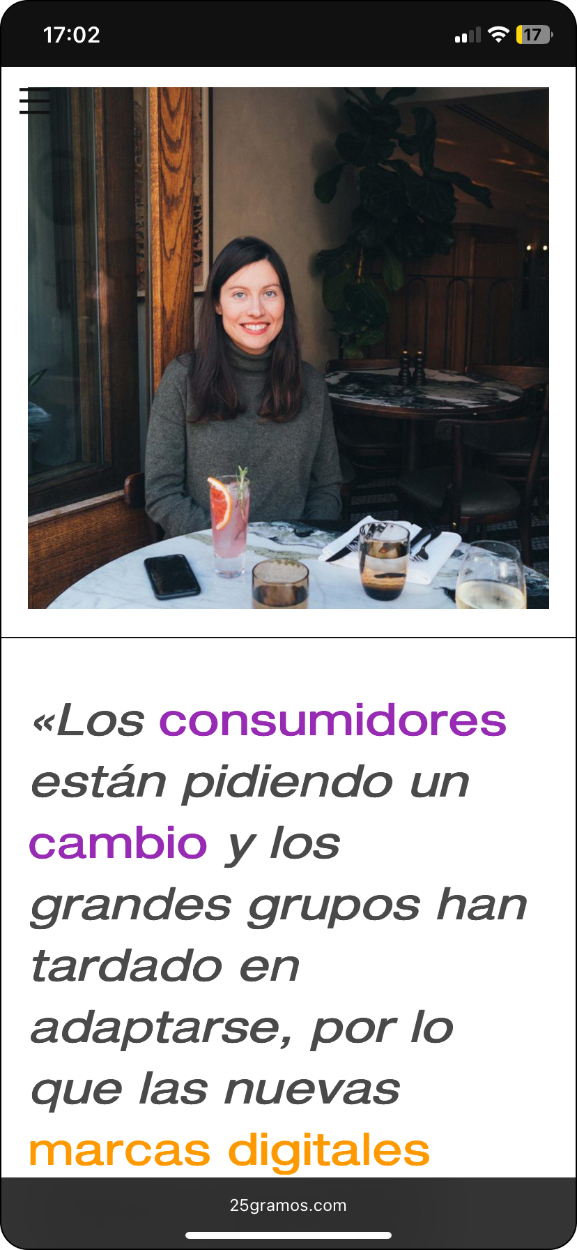
Inside each episode page, we featured a portrait of the guest alongside a highlighted quote or key insight from the conversation, creating a visually engaging and editorial feel. Additionally, each page included a direct link to listen on Spotify, ensuring a seamless transition from discovery to playback.
Inside each episode page, we featured a portrait of the guest alongside a highlighted quote or key insight from the conversation, creating a visually engaging and editorial feel. Additionally, each page included a direct link to listen on Spotify, ensuring a seamless transition from discovery to playback.
Impact
The podcast received an outstanding response, quickly gaining traction among its audience. To celebrate its continuation at episode 25, we decided not to create an entirely new branding but rather evolve the existing one.




New identity, Same essence
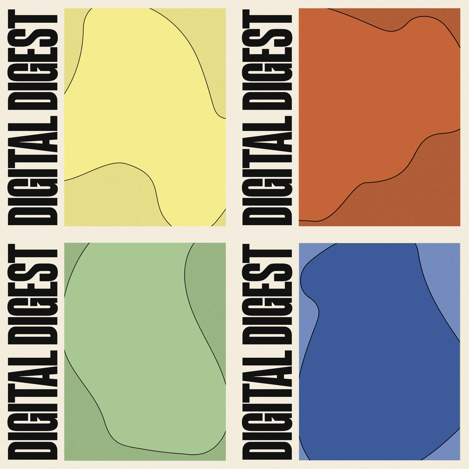
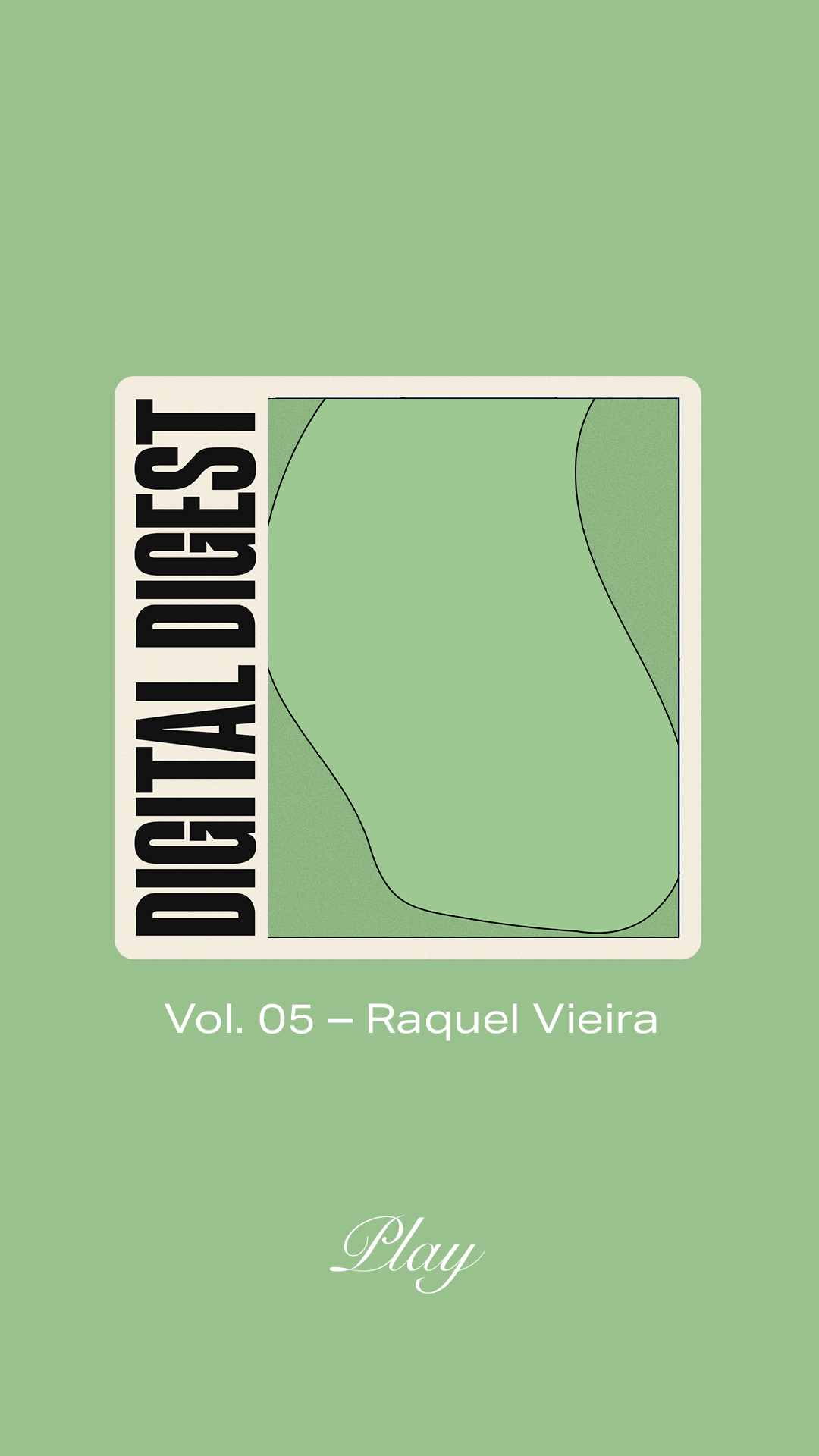
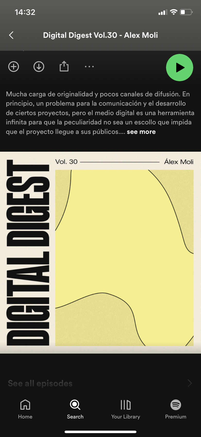
The evolution built upon the original concept of repeating patterns while introducing a fresh palette of pastel colors, giving the identity a renewed and contemporary feel without losing its core essence.
We redesigned the logo to be more robust, using uppercase letters and a clean sans-serif typeface for a stronger presence. The patterns evolved into organic shapes inspired by the nature-based black-and-white textures from the original design.For the background, we simplified the approach by creating a color palette inspired by earthy tones and natural elements, ensuring harmony and visual consistency across all assets.
This way, we continued using the new branding across the microsite and social media, allowing both identities to coexist seamlessly and maintain a cohesive brand experience.
Check the podcast here